Why sharp smart-glasses reviews can disagree about text
Nose pads, optical alignment and the right prescription matter as much as the resolution printed on the box.
 SmartWearGuide · 2026-10-12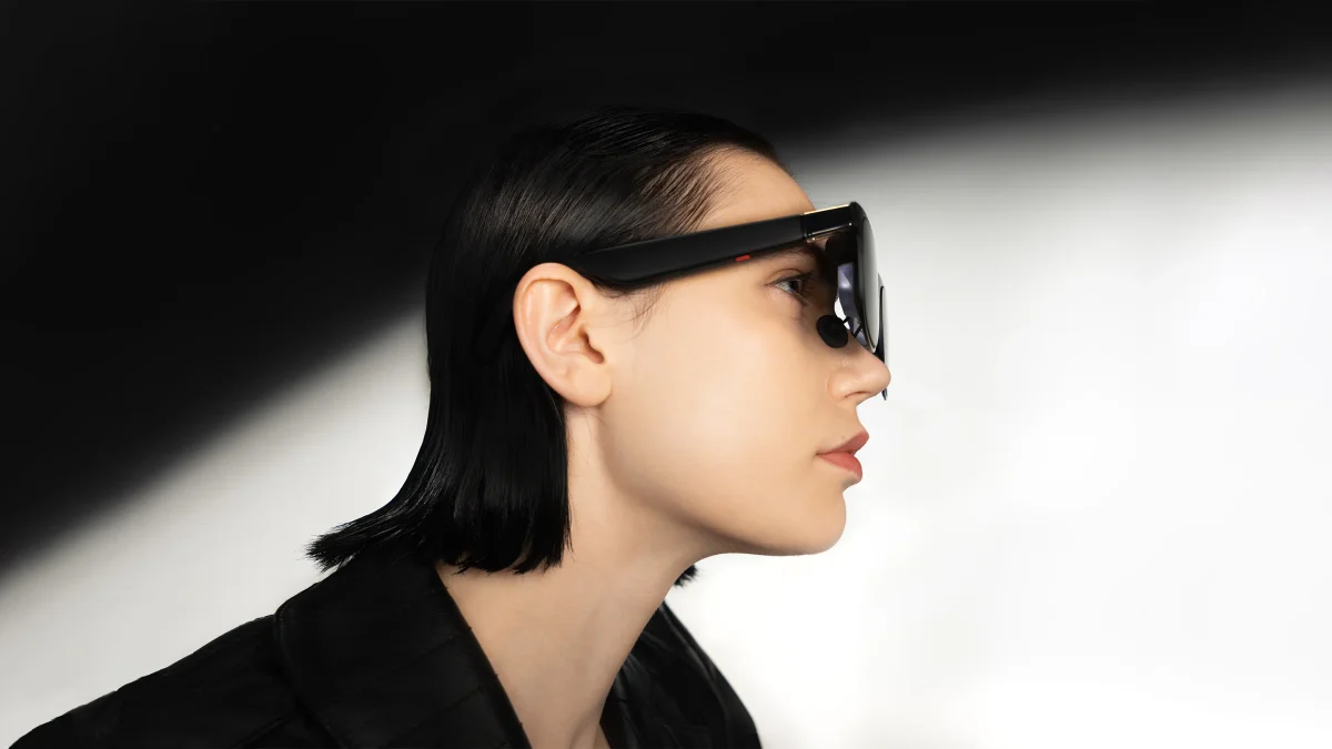
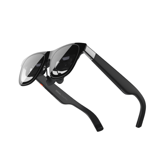
Zachary Boddy's June 2025 Windows Central One Pro review praised the clearer optics and reduced edge clipping, while still noticing grain in text on its 1080p-per-eye displays. Boddy also flagged the upfront choice between two physical IPD sizes: the software adjustment available afterwards might not suit everyone. IPD is the distance between the centres of your pupils. It is a fitting measurement, rather than a sharpness score that a software slider can necessarily rescue.[1]
Vineet Washington's later Notebookcheck test shows why that distinction matters. His IPD was below the specified lower range, and text became uncomfortable even though films and games remained enjoyable. He used prescription inserts and found them easy to attach, yet they did not remove the optical-alignment problem. That is one tester's experience at a known fitting limit, not evidence that One Pro text is universally poor. It is also a useful warning against using a colourful film as the entire fitting test.[2]
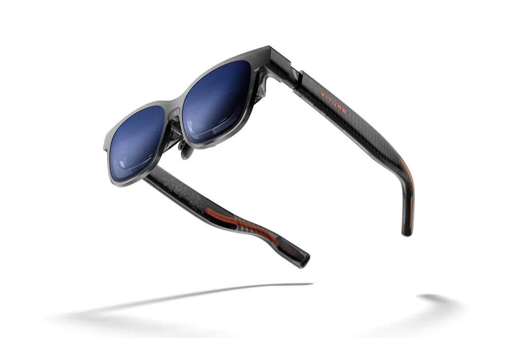
Oliver Cragg found Luma Pro comfortable during weeks of use for Android Authority, helped by flexible hinges and interchangeable nose pads. He liked its crisp image, but noted the -4.0D limit of its built-in myopia adjustment, narrower than some earlier VITURE models. Built-in focus adjustment can therefore be convenient without covering every buyer's correction needs. His positive result and Washington's difficulty can both be accurate: they wore different optics on different faces.[3]
The current VITURE manual lists Regular and Large Luma Pro IPD versions and says its focus adjustment does not cover astigmatism; a separate frame takes custom prescription lenses. XREAL's fitting guide recommends checking that the complete image is centred and uncropped, then adjusting the temples and choosing among three nose-pad sizes. Include the correct custom lenses and frame in the purchase cost. Do not assume that your everyday glasses will fit comfortably underneath.[4] [5]
A worthwhile trial uses your own phone or computer, your intended correction and the font sizes you actually read. Look at a spreadsheet's far corners, small menu labels and subtitles, then wear the glasses long enough to notice slipping or pressure. Change the physical fit before enlarging everything on screen. If readable text requires a position you cannot keep comfortably, another model or a normal monitor may serve that job better.